Z Chamber 20 Developer Commentary
This was chamber 14 in PortalZ: The 2020 Slice.
Developer commentary may include spoilers; I recommend you finish PortalZ before reading further.
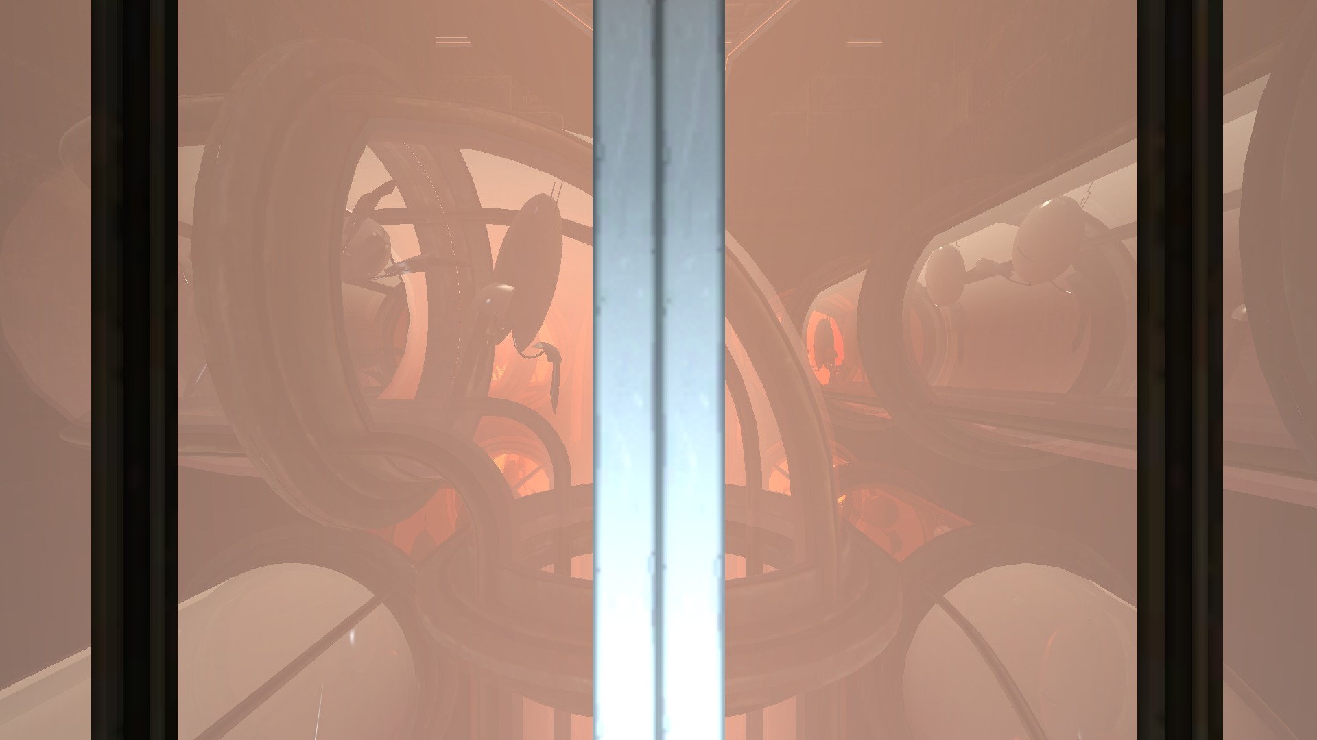
Before the elevators were added, I always felt a little like I didn't want this to start off like every other chamber. As soon as I came up with the new elevator design, I had the idea of how I wanted the level to start, with tubes full of turrets foreshadowing the death trap to come. I wanted to include more of the chamber being assembled than the three panels you can see from the elevator, but for more than that to be worth showing would have required lengthening the elevator ride, and eliminating long elevator rides was the whole point of custom elevators.
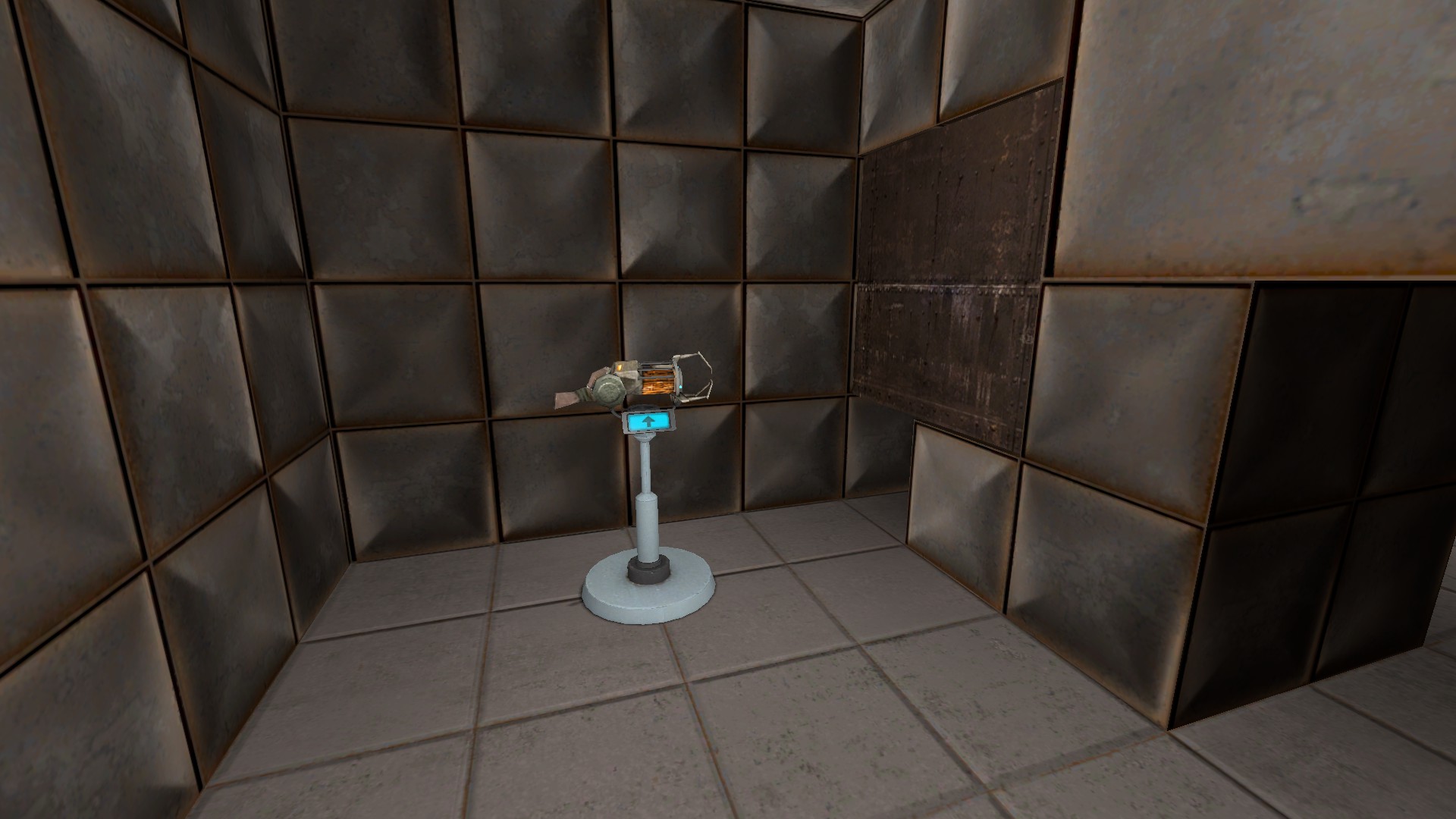
In case it was not obvious, chamber twenty, being the finale, is quite fanservicey. I do not have a canon explanation for how a gravity gun came to be in Aperture, but the fun of taking out an army of turrets with objects launched from a gravity gun was too good to pass up. I did draw the line somewhere, though—early versions of this map also let you get the RPG from Half-Life 2 to take out the turrets (or take out your anger at GLaDOS for trying to kill you in the prime universe), but that felt too out-of-place in what is first and foremost a physics game. You can still pick it up if you use cheats to go through the wall with pictures of cake though.
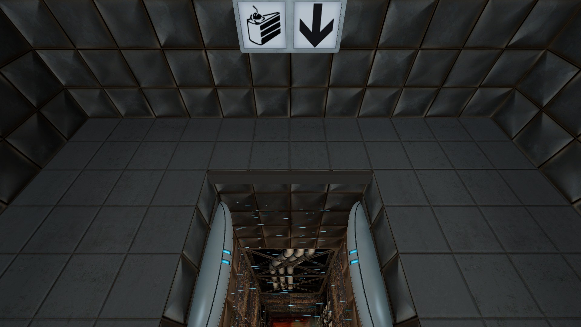
The party room and entry sequence went through a few iterations. Originally, you just dropped straight from the door after the turret room into the party, but I liked the idea of one last fake-out, and then the fall became even longer with you falling next to a vital apparatus vent as your companion cube gets dropped next to you rather than simply sitting in the party room waiting for your arrival.
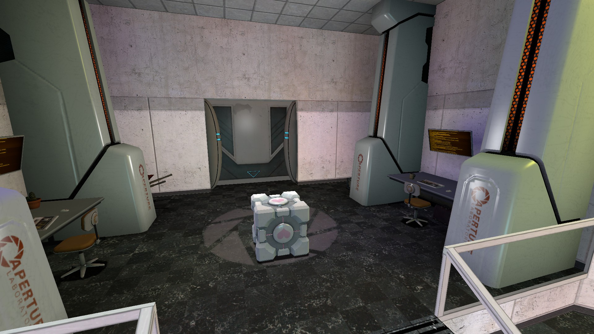
I knew I wanted the party room to have GLaDOS, but I also wanted it to be a fun sandbox where you could play around with objects that are fun to shoot through portals with the gravity gun. Initially it was just a big rectangular room with tables with watermelons and computer parts. Over time, it evolved to look more like GLaDOS's actual chamber, but a little smaller so you did not need to chase lost physics objects across such long distances. I tried several iterations that were closer to to the size of GLaDOS's chamber in portal, but kept reverting to this “cozier” version. Then Portal 2 confirmed at least some of GLaDOS's chamber walls were movable panels too, and I felt more comfortable with all my modifications. No joke, the part I stressed about changing the most was the removing the light over where you enter, because that light was the only element to remain, unchanged, in the Portal 2 redesign of GLaDOS's chamber (over the stalemate resolution button), but there was really no more satisfying way for the player to enter. I had some iterations where the player entered through one of the vents around the chamber or the office area from Portal: Prelude, but what ultimately shipped was just more satisfying, so the vents, office area, and ceiling light got cut. I also removed the upper parts of GLaDOS above the rings because the smaller chamber was simply not large enough to accommodate them. If you got up close and personal with GLaDOS in this room and saw that was not, in fact, her generator core inside those rings, please accept my apologies.
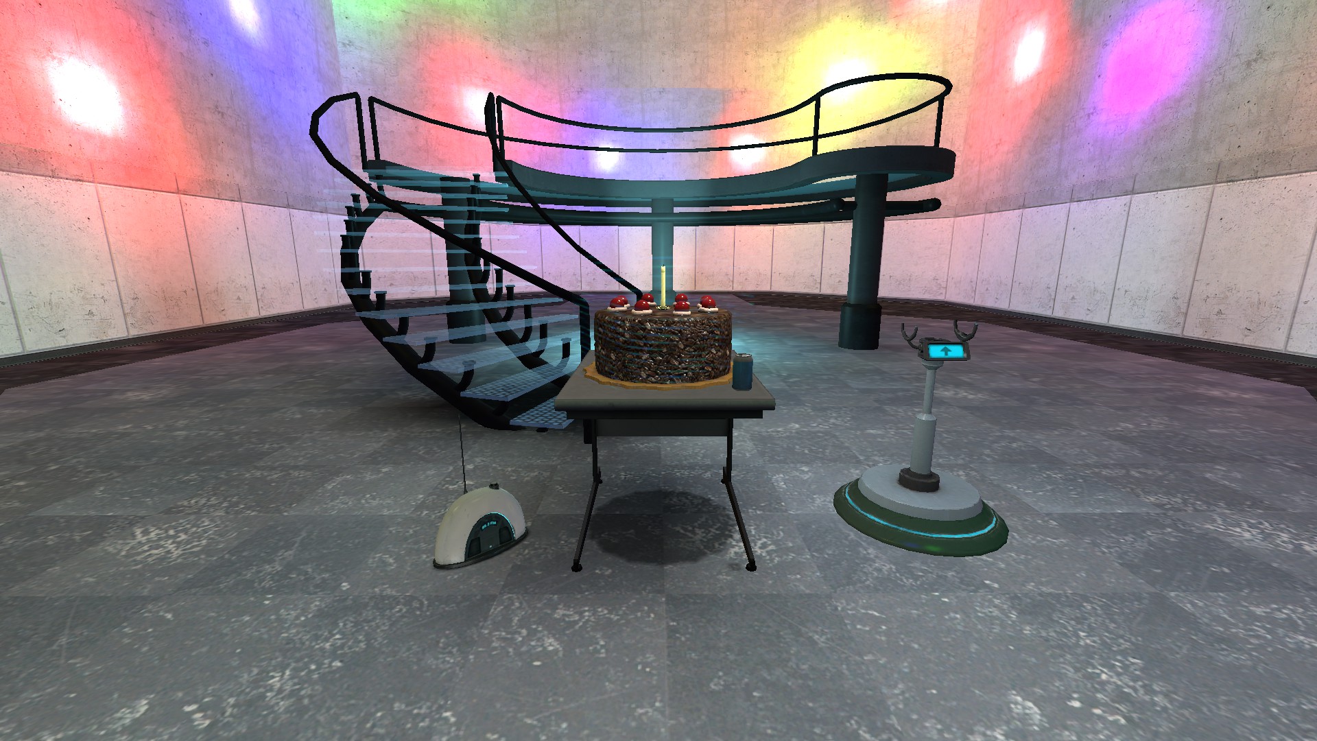
From the earliest versions of this room, there was a desk here with an Aperture PC, a cake, and a radio, intended to be reminiscent of the title screen you unlock when you beat Portal. When I added the portal device pedestal, that was just one object too many, so everything but the radio got moved back to the entryway.
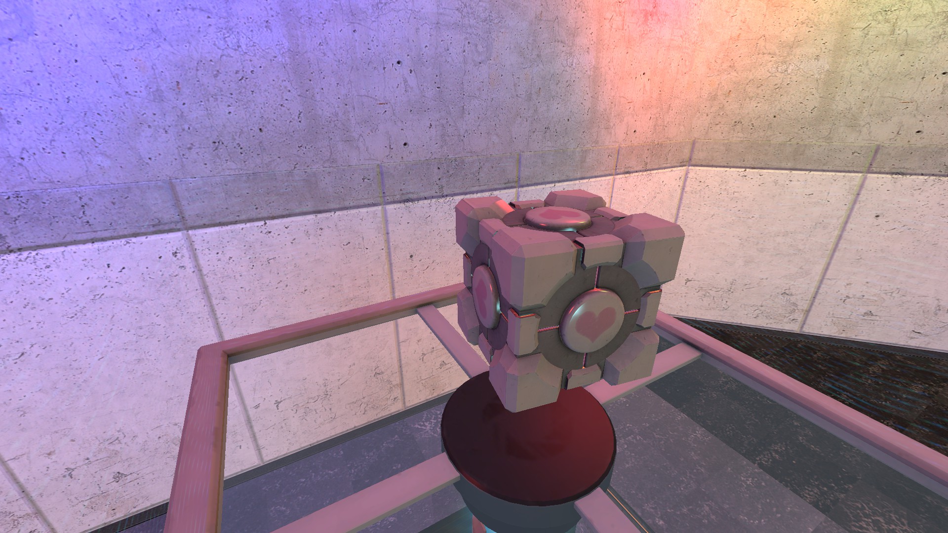
For a while, the credits hall was just portal-proof, and then for a while the credits platform was covered with an invisible portal-only emancipation grid. Finally, after way too long, I remembered enrichment center regulations require both hands to be empty before any cake can be served, and I finally had my excuse for the player to give up the portal device before boarding the platform.
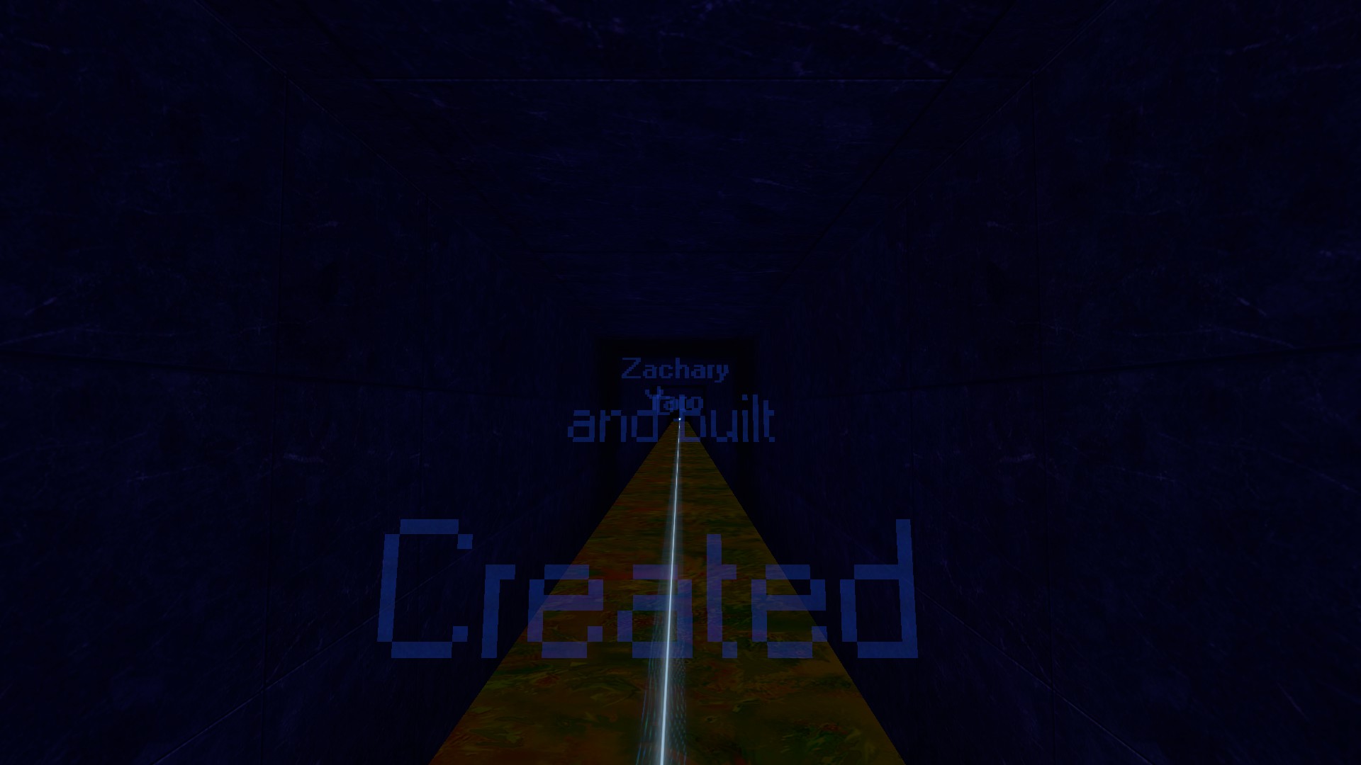
Having the credits be holograms in physical space rather than text on the screen was a decision I made early on, even before I was sure what the whole experience would be. I find myself comparing them to the credits from the 2005 Doctor Who reboot even though I didn't get around to watching that until a year or two after I prototyped these credits.
One final bit of trivia: I originally wanted the map pack to end with the player falling from a portal in the sky to the parking lot from the end of Portal, accompanied by the motto from the Portal trailer, “There's a hole in the sky through which things can fly.” The issue is...you can see a lot from up in the sky, meaning I would either have to build much more than just the parking lot or keep the camera on a very specific area. In the end, it was just not worth the effort for an extra two seconds, and I called it sufficient that the platform's upward angle implied movement toward the surface.
